

The Allure of Oil Rainbow Abstract Textures
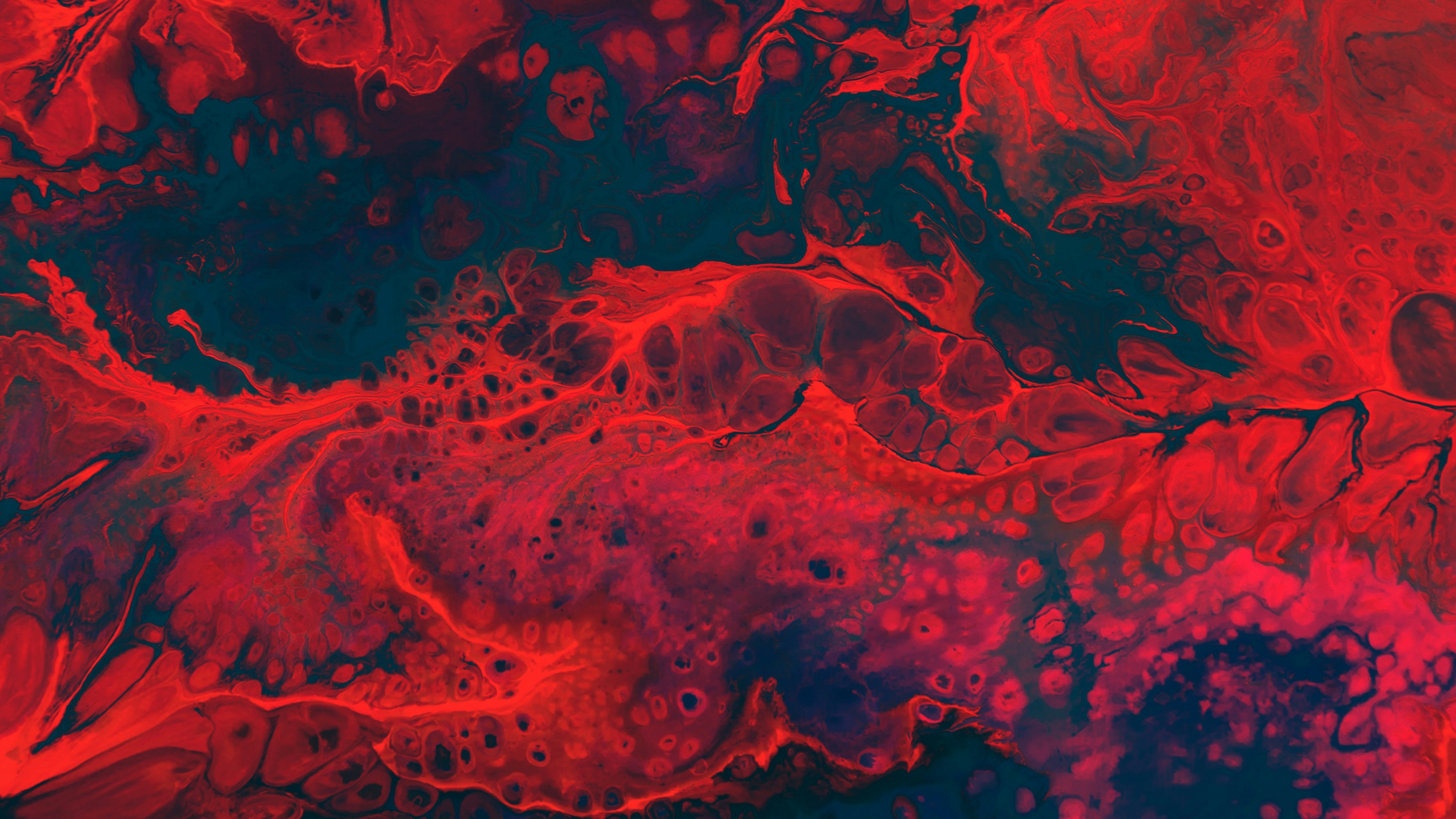
There is something inherently hypnotic about an oil rainbow abstract texture. Whether it is a gasoline spill on a rain-slicked city street or a meticulously crafted digital render, the swirling interplay of vivid colors creates a visual experience that feels both organic and alien. This phenomenon, known scientifically as iridescence, captures the imagination because it defies the static nature of traditional color, shifting and evolving based on the angle of light and the observer’s perspective.
- The Science of Thin-Film Interference
- Recreating Iridescent Textures in Digital Art
- Photography Techniques for Liquid Abstracts
- Psychological Impact of Chromatic Dispersion
- Practical Applications in Modern Design
- Frequently Asked Questions
The Science of Thin-Film Interference
To truly appreciate the beauty of an oil rainbow, one must understand the physics behind it. This visual effect is caused by thin-film interference. When a thin layer of oil floats on top of water, it creates a boundary. Light waves hitting the surface are reflected from both the top layer of the oil and the bottom layer where the oil meets the water.

Because the oil film varies in thickness across the surface, the light waves traveling through it are delayed by different amounts. When these waves recombine, they either reinforce each other (constructive interference) or cancel each other out (destructive interference). This process filters the light, leaving behind only specific wavelengths, which our eyes perceive as a vibrant spectrum of colors. This is why the colors seem to ‘dance’ or shift as you move your head; you are changing the angle of incidence and, consequently, the perceived thickness of the film.
Exploring different abstract visual patterns helps designers understand how to simulate this depth. By mastering the concept of specular highlights and color shifts, artists can evoke a sense of fluidity and movement in their work. Many creators also look into various textures to add tactile realism to their digital compositions, ensuring that the liquid appearance feels authentic rather than flat.

Recreating Iridescent Textures in Digital Art
Achieving a convincing oil rainbow effect in software like Adobe Photoshop, Procreate, or Blender requires a combination of gradient mapping and noise generation. The goal is to mimic the randomness of fluid dynamics while maintaining a cohesive color palette.
Using Gradient Maps and Noise
The most effective way to start is by creating a grayscale perlin noise or cloud texture. This provides the organic, swirling structure of the oil. Once the grayscale map is established, a Gradient Map is applied. Instead of using a simple two-color gradient, artists use a multi-stop gradient containing cyan, magenta, yellow, and deep purples. This simulates the spectral shift found in real-world iridescent films.

Layer Blending and Luminosity
To add depth, layering is essential. Using Overlay or Soft Light blending modes allows the artist to introduce secondary color shifts without losing the underlying contrast. Adding a layer of Gaussian Blur to certain color channels can simulate the way light bleeds at the edges of a liquid droplet, enhancing the ‘wet’ look. Finally, adding a high-contrast white highlight on the peaks of the swirls mimics the reflection of an overhead light source, providing the necessary three-dimensional feel.
Photography Techniques for Liquid Abstracts
Capturing a natural oil rainbow abstract texture requires a keen eye for lighting and a willingness to experiment with macro photography. Because these textures are often small and highly reflective, the environment plays a critical role in the final image.

Lighting and Reflection
Direct flash often kills the iridescence by creating a harsh, white hotspot. Instead, photographers use diffused natural light or a softbox to evenly illuminate the surface. The key is to capture the reflection of a light source (like a window or the sky) within the oil, which emphasizes the curvature of the liquid and the richness of the colors.
Composition and Aperture
Using a wide aperture (low f-stop) creates a shallow depth of field, allowing the photographer to focus on one specific swirl of color while letting the rest of the image melt into a soft, creamy blur. This technique transforms a simple spill into a piece of fine art. Experimenting with underexposure can also help in saturating the colors, making the neon hues of the oil pop against a dark, asphalt-like background.

Psychological Impact of Chromatic Dispersion
Why are we drawn to these chaotic, colorful patterns? Psychologically, iridescent textures trigger a sense of curiosity and discovery. The unpredictability of the patterns mimics the complexity of nature, appealing to our innate preference for fractal-like structures.
In a design context, these textures are often associated with futurism, psychedelia, and luxury. The ‘oil slick’ aesthetic has seen a resurgence in high-fashion and streetwear, where holographic fabrics simulate the same thin-film interference. This visual language communicates innovation, fluidity, and dynamism, making it a powerful tool for brands wanting to appear cutting-edge or avant-garde.
Practical Applications in Modern Design
Beyond fine art, the oil rainbow abstract texture is widely used in UI/UX design and branding. We see this in the form of ‘mesh gradients,’ which are simplified versions of these complex fluid textures.
- App Backgrounds: Using soft, iridescent gradients creates a modern, airy feel that reduces visual fatigue while remaining engaging.
- Packaging Design: Foiling and holographic prints on packaging use physical thin-film interference to attract the consumer’s eye on a crowded shelf.
- Motion Graphics: Animated liquid textures are frequently used in title sequences for sci-fi films or music videos to represent energy, consciousness, or digital fluidity.
By blending the organic unpredictability of nature with the precision of digital tools, designers can create visuals that feel alive. The secret lies in the balance between saturation and contrast, ensuring the colors remain vivid without becoming overwhelming to the viewer.
Conclusion
The oil rainbow abstract texture is more than just a chemical accident on a pavement; it is a masterclass in physics and visual harmony. From the science of thin-film interference to the creative application of gradient maps in digital art, these iridescent patterns continue to inspire artists and designers worldwide. By understanding the relationship between light, angle, and color, we can harness this aesthetic to create work that is not only visually stunning but emotionally resonant.
Frequently Asked Questions
How is the rainbow effect created in oil spills?
The effect is caused by thin-film interference. When oil spreads over water, it forms a layer only a few nanometers thick. Light reflects off both the top and bottom of this layer, and depending on the thickness, certain wavelengths of light interfere constructively, creating the vivid rainbow colors we see.
What are the best tools for creating an iridescent digital texture?
Adobe Photoshop and Procreate are excellent for 2D work, using Gradient Maps and Noise filters. For 3D artists, Blender or Cinema 4D are preferred, as they allow for the creation of custom shaders that calculate iridescence based on the viewing angle (Fresnel effect).
How can I photograph oil rainbows effectively?
Use a macro lens for close-up detail and avoid direct flash. Opt for diffused, natural lighting to preserve the spectral colors. A shallow depth of field (low f-stop) helps isolate a specific swirl of color, turning the abstract texture into a professional composition.
What is the difference between iridescence and pearlescence?
Iridescence involves a dramatic shift in color as the viewing angle changes, often resulting in bright, spectral colors. Pearlescence is a softer, more muted version of this effect, usually characterized by a milky, iridescent sheen with less intense color shifts, common in pearls and certain paints.
Where can I find high-quality abstract oil textures for design?
High-resolution textures can be found on stock sites like Unsplash or Pexels. However, creating your own using a smartphone camera and a small amount of oil in a shallow tray of water is often the best way to get unique, high-context imagery for a specific project.
Related posts:


Pieces in abstract-texture talk to each other across pages — follow the thread with Abstract Black and White Rainbow Texture: A Design Guide.
Pass this link to someone who appreciates bold, abstract design.
