

The Allure of Softness: Understanding Pastel Abstract Patterns
In a world dominated by high-contrast visuals and aggressive digital marketing, the rise of the pastel abstract pattern represents a collective desire for serenity, balance, and visual breathing room. These designs, characterized by desaturated hues and non-representational forms, transcend simple decoration; they evoke a psychological response of calm and accessibility. Whether it is the ethereal flow of a digital mesh gradient or the structured softness of a geometric arrangement, these patterns have become staples in modern visual communication.
- What Defines Pastel Abstract Design
- The Psychology of Soft Color Palettes
- Popular Types of Pastel Abstract Patterns
- Practical Applications in Design and Branding
- How to Create Balanced Abstract Compositions
- Conclusion
- Frequently Asked Questions
What Defines Pastel Abstract Design
At its core, a pastel abstract pattern is the intersection of color theory and non-objective art. Unlike representational art, which seeks to depict a specific object or scene, abstract patterns focus on the relationship between shape, line, and color to convey a mood or feeling. The ‘pastel’ element refers to colors that have a high value (brightness) and low saturation, creating a ‘milky’ or ‘muted’ appearance.

To truly master this aesthetic, one must understand the role of negative space. In pastel compositions, the space between elements often carries as much weight as the elements themselves. This prevents the design from feeling cluttered, ensuring that the viewer’s eye can glide effortlessly across the canvas. Many designers leverage minimalism to enhance the impact of these soft tones, ensuring that the focus remains on the harmony of the palette rather than the complexity of the shapes.
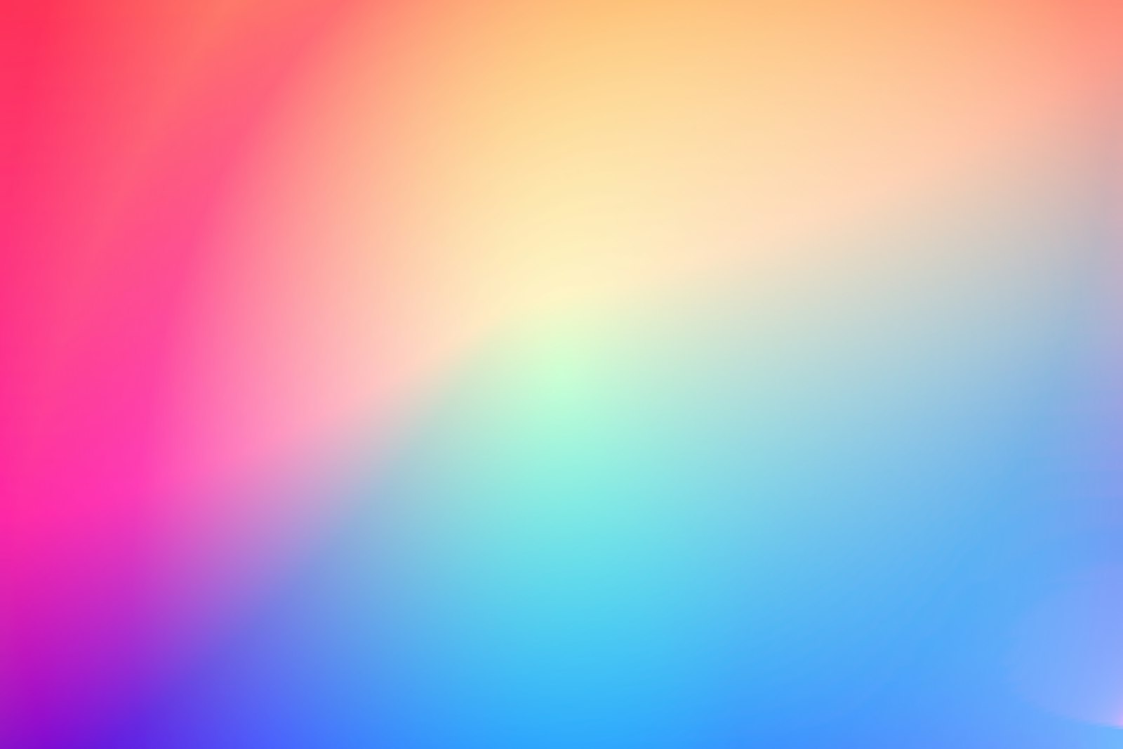
Furthermore, the use of gradients has revolutionized this style. The shift from flat pastel blocks to fluid, blending transitions—often called ‘aurora’ or ‘mesh’ gradients—adds a sense of depth and dimensionality that mimics natural phenomena like sunrise or iridescent bubbles. This evolution allows the digital art community to create backgrounds that feel organic despite being mathematically generated.

The Psychology of Soft Color Palettes
Colors are not merely visual stimuli; they are emotional triggers. The effectiveness of pastel abstract patterns lies in their ability to lower the viewer’s cognitive load. While neon colors demand immediate attention and can cause visual fatigue, pastels invite a slower, more contemplative engagement.
Emotional Triggers of Key Pastel Hues
- Pastel Blue: Associated with trust, stability, and tranquility. It is frequently used in healthcare and wellness branding to reduce anxiety.
- Pastel Pink: Evokes feelings of warmth, compassion, and softness. It is often utilized in beauty and lifestyle sectors to create a nurturing atmosphere.
- Mint Green: Represents freshness, renewal, and balance. It bridges the gap between the energy of yellow and the calm of blue.
- Lavender: Suggests creativity, mystery, and elegance, often used to add a sophisticated yet gentle touch to a composition.
When these colors are arranged in an abstract fashion, the absence of a recognizable subject allows the viewer to project their own emotions onto the piece. This semantic flexibility is why pastel abstract patterns are so effective in interior design and background imagery; they provide a mood without imposing a specific narrative.

Popular Types of Pastel Abstract Patterns
Not all abstract patterns are created equal. Depending on the goal—whether it is to energize or soothe—designers employ different structural approaches.
Organic and Biomorphic Shapes
Biomorphic abstraction draws inspiration from nature—think of amoebas, clouds, or river stones. These patterns use curvilinear lines and asymmetrical balances to create a sense of movement and growth. Because there are no harsh angles, these designs feel approachable and human. They are particularly effective in branding for organic products or mental health services where a ‘soft touch’ is essential.

Soft Geometric Abstraction
Drawing influence from the Bauhaus movement but stripping away the rigid intensity, soft geometric patterns utilize circles, triangles, and rectangles with rounded corners. By pairing a rigid structure with a muted color palette, the designer achieves a balance between professionalism and friendliness. This style is widely seen in modern infographics and corporate slide decks to make data feel less intimidating.
Fluid and Watercolor Textures
Watercolor patterns mimic the unpredictable nature of pigment diffusing in water. The result is a series of translucent layers and soft edges that create an ethereal, dreamlike quality. In the digital realm, this is achieved through ‘blur’ filters and blending modes, resulting in a sophisticated texture that adds a tactile feel to a flat screen.

Practical Applications in Design and Branding
The versatility of the pastel abstract pattern makes it a powerhouse tool for various industries. Its primary strength is its ability to act as a sophisticated backdrop that does not compete with the foreground content.
Web Design and UI/UX
In user interface design, visual hierarchy is everything. Using a pastel abstract background allows a designer to create a sense of brand identity without distracting the user from the Call to Action (CTA). Soft gradients can be used to subtly guide the eye toward important elements, improving the overall user experience by reducing visual noise.
Interior Design and Home Decor
The ‘Japandi’ (Japanese and Scandinavian) and ‘Millennial Pink’ trends have heavily relied on pastel abstracts. Whether in the form of a large canvas print or a textured wallpaper, these patterns help in creating a sanctuary environment. The lack of jarring contrast helps in lowering stress levels within a living space, making the room feel more expansive and airy.
Packaging and Branding
For luxury skincare or artisanal confectionery, pastel abstract patterns signal a ‘premium yet gentle’ product. By using a muted color story, brands can differentiate themselves from competitors who use loud, saturated colors to grab attention. It communicates a sense of quiet confidence and high quality.
How to Create Balanced Abstract Compositions
Creating a successful pastel abstract pattern requires more than just picking a few light colors. It requires a strategic approach to composition and contrast.
- Establish a Dominant Hue: Choose one primary pastel color to anchor the design. This prevents the palette from looking like a random assortment of colors and provides a cohesive thread.
- Use ‘Accent’ Saturation: To prevent the design from looking washed out, introduce one or two elements with slightly higher saturation. This creates a focal point and adds necessary contrast.
- Experiment with Layering: Use opacity settings to overlap shapes. The intersection of two pastel colors creates a third, unique shade, adding visual complexity without adding clutter.
- Balance Weight and Scale: Contrast large, sweeping shapes with smaller, detailed elements. This creates a rhythmic flow that keeps the viewer engaged.
For those new to the craft, utilizing tools like Adobe Illustrator’s ‘Blend Tool’ or Canva’s ‘Gradient’ elements can accelerate the process. The key is to iterate often and trust the intuitive feel of the composition over rigid rules.
Conclusion
The pastel abstract pattern is more than a passing trend; it is a response to the sensory overload of the digital age. By blending the principles of color psychology with the freedom of abstract form, these designs provide a necessary emotional respite. Whether applied to a high-traffic website, a corporate brand, or a quiet living room, the power of soft hues and fluid shapes lies in their ability to communicate peace, sophistication, and inclusivity. As we move toward more human-centric design, the embrace of the soft, the muted, and the abstract will only continue to grow.
Frequently Asked Questions
How do I prevent my pastel abstract design from looking ‘too childish’?
The key is to balance the soft colors with professional typography and ample white space. Incorporate a few deeper, muted tones (like charcoal or navy) as accent colors to provide a sophisticated anchor to the lightness of the pastels.
What is the best way to choose a pastel color palette?
Start with a ‘hero’ color and use a color wheel to find analogous colors (those next to each other). For more contrast, use complementary colors but keep the saturation low across the board to maintain the ‘pastel’ feel.
Can pastel abstract patterns be used for high-conversion landing pages?
Yes, provided they are used as backgrounds. Because they don’t compete with the text, they can actually increase conversion rates by making the page feel more inviting and less aggressive than high-contrast designs.
What is the difference between a ‘pastel’ color and a ‘muted’ color?
Pastel colors are high-value and low-saturation (light and soft), whereas muted colors can be any value (dark or light) but always have low saturation (they contain a bit of grey or their complementary color).
Which software is best for creating fluid pastel gradients?
Adobe Illustrator is excellent for vector-based mesh gradients, while Figma and Canva are great for quick, modern UI gradients. For a more organic, painterly feel, Procreate or Photoshop with watercolor brushes is recommended.
Related posts:

Abstract work rewards a second look — browse more of abstract-patterns when you are ready for a new backdrop.
Share this page with a fellow art lover looking for their next wallpaper.
