
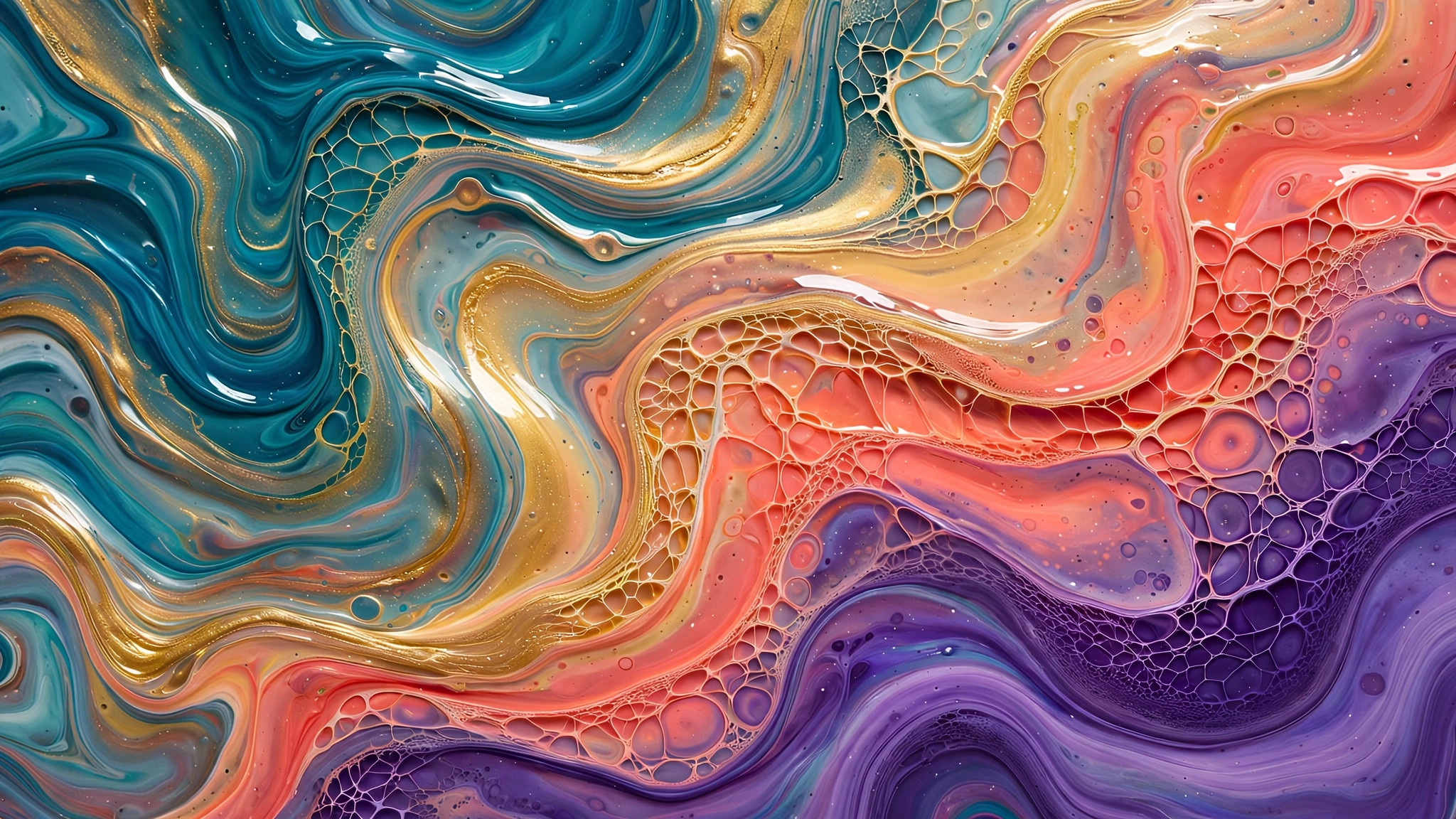
Pour acrylic paint onto a canvas, tilt it, and watch rivers of color carve their own paths — splitting, merging, forming cellular patterns that look almost biological. Acrylic pour art has become one of the most beloved abstract mediums of recent years, and fluid acrylic pour wallpapers bring its hypnotic beauty to screens: cells, lacing, and color rivers frozen at their most gorgeous moment.
What draws people to pour art is its collaboration with chance. The artist chooses the colors and sets the conditions, but the paint itself decides the details. Every pour is a negotiation between intention and physics — and the results have an organic authenticity that fully controlled digital art struggles to match.
The Signature Effects
Acrylic pours produce distinctive visual phenomena that define the wallpaper style:
- Cells: round, cell-like formations where one color breaks through another — the most iconic pour effect. They look organic, almost like microscopic life or planetary surfaces, and they’re endlessly fascinating to look at.
- Lacing: delicate web-like patterns where thin paint stretches over thicker paint — fine, intricate, lace-like. The most detailed and textile-like of the pour effects.
- Color rivers: flowing bands where tilted paint has streamed across the surface — dynamic, directional, full of movement.
- Marbling: colors swirled together without fully mixing — the classic stone-like patterns, endlessly varied.
- Negative space blooms: areas where the canvas shows through or a base color dominates, giving the composition breathing room.
Why Pour Art Makes Extraordinary Wallpaper
Pour patterns hit a rare sweet spot for background art. They’re detailed without being busy — the eye finds endless micro-detail in the cells and lacing, but there’s no subject demanding attention. They’re colorful without being chaotic — the fluid mixing naturally harmonizes hues that would clash if placed side by side deliberately. And they’re unique by nature — no two pours are alike, so your wallpaper is genuinely one of a kind in a way few digital backgrounds can claim.
There’s also a tactile quality that photographs of pours preserve beautifully. You can sense the paint’s thickness, the gloss of the medium, the physical reality of the surface. On a flat glowing screen, that hint of materiality is deeply satisfying — a reminder of the physical world behind the pixels.
Readers drawn to bolder marks can explore Red Splatter Abstract Drawing: Techniques and Art Guide for a companion treatment.
Pour Wallpaper Styles
Classic multicolor pours
The full rainbow river — several colors flowing together with cells and lacing throughout. Joyful, rich, and full of discovery. These are the most popular pour wallpapers and the most versatile; the natural color harmony keeps them wearable despite their vividness.
Monochrome and duotone pours
Pour techniques in limited palettes — black and white with gold, blues in several depths, warm earth tones. The pour effects become pure texture and form without chromatic distraction. These are the sophisticated choice: all the organic beauty, maximum elegance.
Ocean and earth pours
Pours in naturalistic palettes — sea blues and sandy whites, forest greens and bark browns. These read almost as aerial landscape photography: coastlines, river deltas, geological formations. They’re the pour wallpapers most likely to trigger that “is this real?” double-take.
Metallic pours
Gold, copper, silver, and pearl paints in the mix — liquid luxury. The metallics catch the “light” of the screen beautifully, giving these wallpapers a luminous quality that flat colors can’t match. Stunning on high-brightness displays.
Macro pour details
Extreme close-ups of cell formations and lacing — pure abstract texture at the finest scale. These are the most versatile pour wallpapers because they’re fully non-representational; they work as subtle, beautiful background texture anywhere.
Choosing and Using Pour Wallpapers
- Gloss vs. matte: glossy pour photography (wet-look, reflective) feels luminous and premium; matte or satin finishes feel more artistic and calm. Neither is better — they’re different moods.
- Scale of detail: fine lacing and small cells read as texture (desktop-friendly); big bold cells and rivers read as subjects (lock-screen-friendly).
- Color temperature: warm pours energize; cool pours calm. Match to the screen’s purpose and your room’s lighting.
- Orientation: pours often have a flow direction from the tilt. Align it with your screen — vertical flows for phones, horizontal for desktops — for the most natural feel.
Cells, Lacing, and the Chemistry of Chance
Acrylic pour art’s signature effects — the cellular patterns, the delicate lacing — emerge from real chemistry, and knowing a little of it helps you choose the best pieces. Cells form when silicone or similar additives create surface-tension differences between paint layers: the lower-tension areas pull apart, revealing the colors beneath in organic, cell-like structures. It’s controlled chaos — the artist sets the conditions, but the physics decides the details.
Lacing, the fine web-like veining, happens at the boundaries where different paint densities meet and partially mix. The most beautiful lacing is delicate and extensive — fine lines spreading widely rather than thick clumps. When evaluating pour wallpapers, look at the lace quality: fine, intricate lacing indicates a well-executed pour with good paint consistency; blobby, heavy mixing suggests the colors were overworked and the magic moment missed.
The color rivers — the broad flowing bands — reveal the pour technique. A skilled dirty-pour (multiple colors poured from one cup) creates rivers with clean edges and internal marbling; each band distinct yet related. Rivers that bleed into muddiness indicate colors that weren’t properly separated. The best pour art maintains color identity even in motion — you can name every hue in the flow, which is exactly what keeps the result vibrant rather than murky.
The wider technique family behind these effects is surveyed in the Wikipedia article on acrylic painting techniques.
The Philosophy of the Pour
There’s a lesson in acrylic pours that extends beyond wallpaper. The artist sets up the conditions — chooses colors, prepares the canvas, decides when to tilt — and then surrenders control. The beautiful parts are the parts nobody planned.
As a daily backdrop, a pour wallpaper is a small reminder of that wisdom: do the preparation honestly, then let things flow. Some of the best outcomes in life, like the best cells in a pour, are the ones you didn’t design — you just made them possible.
Related posts:

Abstract work rewards a second look — browse more of acrylic-ink when you are ready for a new backdrop.
Pass this link to someone who appreciates bold, abstract design.

