

Drop ink into water and watch: for a few seconds, physics becomes art. Tendrils unfurl, clouds bloom, colors collide and marble together in patterns no human hand could draw. Then it’s gone — dispersed, diluted, unrepeatable. Ink in water wallpapers capture those fleeting seconds and hold them still: fluid motion frozen at its most beautiful moment, turned into background art.
There’s a reason this imagery never gets old. It sits at the intersection of chaos and order — completely unpredictable in detail, completely reliable in beauty. Every ink-in-water image is a unique event, a collaboration between artist and fluid dynamics where the water does half the designing.
The Moment of Capture
What makes ink-in-water imagery special is its temporality. Unlike a painting that exists to be preserved, an ink cloud exists to disappear. Photographing or filming it is an act of rescue — saving a few seconds of beauty from oblivion.
That rescued quality gives these wallpapers an emotional charge that more deliberate designs lack. You’re looking at something that no longer exists, that can never exist again in exactly the same form.
The best ink-in-water wallpapers preserve the sense of motion. You should feel the bloom happening — tendrils still unfurling, edges still diffusing. A good capture has direction and energy; a bad one looks like a static blob. When browsing, trust your gut: if it feels frozen mid-dance, it’s a keeper.
Styles of Ink in Water
Single-ink blooms
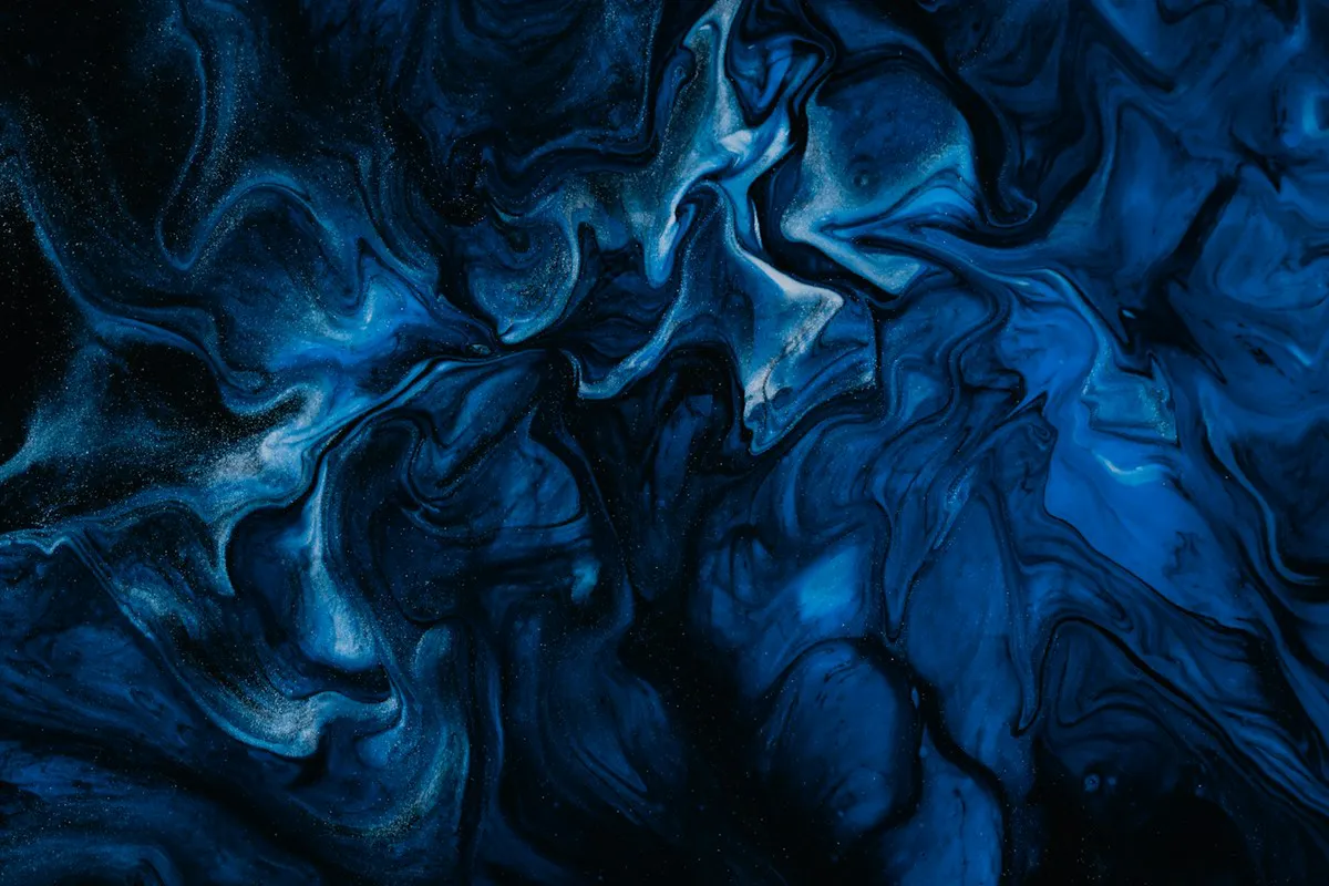
One color dispersing in clear water — the purist’s choice. Black ink in water is the classic: dramatic, elegant, endlessly sophisticated. Single-color blooms in jewel tones (sapphire, emerald, crimson) are equally stunning. The simplicity lets you appreciate the pure physics of the diffusion.
Multi-ink collisions
Several colors released together, marbling and intertwining. These are the most spectacular ink wallpapers — galaxies of color blooming in water. The interplay of hues creates secondary colors at the boundaries that no palette could plan. Joyful, dynamic, mesmerizing.
Ink on dark
White or light-colored ink blooming against black water (achieved with lighting and background). Ethereal, ghostly, premium — like nebulae or deep-sea creatures. These are extraordinary on OLED screens and make unforgettable lock screens.
Macro detail crops
Extreme close-ups of the diffusion edge — where ink meets water at the finest scale. These read as pure abstract texture: filigree, lace, smoke. The most versatile ink wallpapers because they’re fully abstract; they work anywhere a subtle, beautiful texture is needed.
The luxury direction continues in Abstract Ink Gold Design: Elevating Modern Spaces with Luxury Art, a companion treatment of gold design for modern spaces.
Color Behavior in Water
Understanding a little fluid physics helps you choose well. Denser inks sink and billow; lighter inks spread across the surface. Warm colors tend to read as advancing toward the viewer, cool colors as receding — so a wallpaper with warm ink blooming over cool water has natural depth. Complementary ink pairs (orange and blue, for instance) create electric boundaries where they meet; analogous pairs (blue and teal) merge into seamless flows.
Readers drawn to teal palettes can explore Abstract Ink Teal Art: A Complete Guide to Modern Decor for a companion treatment.
Choosing Ink Wallpapers for Screens
- Energy level: multi-ink collisions are high-energy — thrilling on lock screens, potentially restless on work desktops. Single-ink blooms are calmer and more versatile.
- Background tone: ink on white/bright backgrounds feels airy and artistic; ink on dark feels dramatic and premium. Match to your lighting and mood.
- Detail scale: fine, lacy diffusion reads as texture (good for desktops); bold, billowing clouds read as subjects (better for lock screens and tablets).
- Orientation: ink blooms usually have a “source point” where the ink was released. Position it thoughtfully — behind the clock on a lock screen, toward an edge on a desktop.
Creating Your Own Ink in Water Art
This is one of the most accessible forms of art photography. You need: a clear tank or large glass of water, ink (food coloring works beautifully and is cheap), good lighting (side light shows the blooms best), and a camera that can shoot fast. Drop, shoot, repeat.
Most attempts are duds; the keepers are magical. That’s the nature of the medium — you’re collaborating with chance.
Tips from practitioners: use room-temperature water for slow, graceful blooms and cold water for sharper tendrils. Backlight the tank for glowing edges. Shoot in bursts — the bloom evolves in fractions of a second. And try white ink (titanium white acrylic, thinned) on a black background for the most dramatic results of all.
The Physics Behind the Beauty
Ink-in-water photography captures real fluid dynamics, and understanding a little of the physics deepens appreciation. What you’re seeing is a collision of densities and viscosities: the ink, heavier than water, sinks and spreads while water’s resistance sculpts it into tendrils and billows. The most beautiful formations happen in a brief window — seconds — before diffusion turns everything to uniform murk. Every ink-in-water image is a photograph of a fleeting moment that can never be exactly repeated.
This unrepeatability is central to the style’s appeal. Unlike a gradient that can be regenerated identically, each ink capture is unique — a genuine moment of chaos resolved into beauty. That authenticity reads subconsciously: viewers sense, correctly, that they’re looking at something that actually happened rather than something computed. In an age of infinite digital reproducibility, the singular event has special value.
The technique also explains the style’s characteristic color behavior. Ink disperses from dense cores to transparent edges, creating natural gradients that no digital tool quite replicates — the falloff follows physical laws rather than mathematical curves. When choosing ink-in-water wallpapers, look for this organic falloff: pieces where the transparency feels earned by diffusion rather than applied as an effect. The difference is subtle but it’s what separates breathtaking captures from decent imitations.
The material at the center of every capture is surveyed in the Wikipedia article on ink.
Beauty That Refuses to Repeat
Ink in water wallpapers carry a quiet philosophical gift: proof that unrepeatable moments can be beautiful precisely because they’re unrepeatable. In a digital world of infinite copy-paste, where every image can be duplicated perfectly forever, there’s something deeply human about a background that says: this happened once, for a few seconds, and it was gorgeous. Then it was gone — except for this, which you get to keep.
Related posts:


If this set speaks to you, Abstract Ink Teal Art: A Complete Guide to Modern Decor continues the alcohol-ink conversation in a new direction.
Pass this link to someone who appreciates bold, abstract design.

