
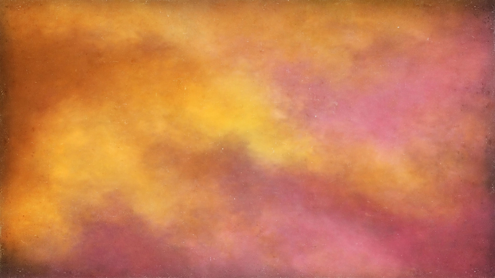
Perfection is overrated. The smoothest digital gradient — mathematically flawless, every transition seamless — can feel strangely lifeless, like air conditioning: technically ideal, emotionally empty. Grainy gradient wallpapers fix this with the oldest trick in visual art: they add imperfection. A whisper of film grain over flowing color, and suddenly the digital feels analog, the perfect feels human, the flat feels tactile.
Film grain is the visible texture of analog photography — tiny random variations in tone caused by silver particles in film emulsion. For decades, photographers tried to minimize it. Then digital made images perfectly clean, and artists realized something was missing. Grain had been adding something all along: a sense of material, of reality, of the image being a physical thing rather than a mathematical abstraction.
What Grain Does to a Gradient
A pure gradient is, informationally, almost nothing — just color changing smoothly across space. That emptiness is its weakness as well as its strength: there’s nothing for the eye to hold onto, which can make the image feel hollow or cheap. Grain solves this elegantly:
- It adds micro-texture. The eye detects the fine noise and reads the surface as having physical substance — like paper, like film, like something real.
- It kills banding. This is the technical superpower. The random variation of grain breaks up the visible stair-steps in subtle gradients, disguising the limitations of color depth. Many designers add grain specifically for this reason.
- It unifies the composition. Grain sits over everything equally, tying disparate color regions together into a single coherent surface.
- It adds nostalgia. We associate grain with film, with memory, with images that mattered enough to be printed. A grainy gradient borrows that emotional weight.
The textural tradition in abstract design runs deep — mint texture studies and red texture explorations show how surface quality transforms flat color.
Degrees of Grain: Finding Your Texture
Not all grain is equal, and the amount matters enormously:
- Whisper grain (1-3%): barely visible, felt more than seen. Just enough to kill banding and add a hint of material. The professional’s choice — most “clean” premium gradients actually have this.
- Film grain (5-10%): clearly visible texture, the classic photographic feel. The image now reads as analog-influenced. This is the sweet spot for most grainy gradient wallpapers.
- Heavy grain (15%+): the texture becomes a subject in itself — gritty, raw, lo-fi. Dramatic and distinctive, but it starts competing with the gradient rather than supporting it. Best for statement screens.
Grain character matters too. Fine, tight grain feels like quality film stock; coarse, chunky grain feels like pushed high-ISO film or newsprint. Monochromatic (luminance-only) grain is cleaner and more versatile; colored grain adds a vintage, sometimes unpredictable character. The minimalist textural approach is examined in minimalist texture guides.
For color in a single hue, see Monochrome Gradient Wallpapers: One Hue, Endless Depth.
Grain and Color: Pairings That Work
Certain combinations have earned classic status:
- Grain + sunset gradients: the golden-hour photograph that never was — warm, nostalgic, deeply evocative.
- Grain + dark gradients: the night-photography feel — moody, cinematic, premium. Grain in dark areas mimics exactly how real film behaves.
- Grain + pastel gradients: soft color with tactile surface — like a well-worn art print. Unexpectedly sophisticated.
- Grain + duotone: the vintage poster — bold limited color made human by texture. Timeless.
The 3D-textured end of this family connects to 3D texture studies, where surface and form interact.
For neon color from the film era, see Retro 80s Gradient Wallpapers: Chrome Lines and Synthwave Color.
Practical Notes
- Resolution and grain: grain needs pixels to live in. On low-resolution sources, grain turns to mush. This style demands quality files.
- Don’t double-grain: if your wallpaper already has grain, don’t add more via filters — stacked grain looks dirty, not textured.
- Viewing distance: grain reads differently at different distances. Preview at your actual viewing distance; grain that’s perfect on a phone may vanish on a desktop viewed from arm’s length.
- OLED and grain: grain in near-black areas can shimmer slightly on some OLED panels. If you notice it, choose a version with gentler grain in the darks.
Grain as a Design Material
Film grain in digital design isn’t just nostalgia — it’s a functional material with specific properties. The most important is its ability to break banding: smooth digital gradients, especially in dark tones, often display as visible steps rather than smooth transitions. A layer of fine grain disrupts those steps, tricking the eye into perceiving continuous tone. This is why grainy gradients look smoother than clean ones on many screens — the noise paradoxically creates the impression of perfection.
Grain size is the critical variable. Fine grain (barely visible at normal viewing distance) adds texture without drawing attention — it’s felt more than seen. Coarse grain becomes a visible feature, part of the composition’s character.
The choice depends on intent: fine grain for polish, coarse grain for attitude. What doesn’t work is grain so subtle it only appears as muddiness, or so heavy it obscures the gradient beneath. Like all textures, it needs conviction.
There’s also the question of grain uniformity. Real film grain varies with exposure — denser in shadows, finer in highlights. Digital grain that mimics this behavior feels organic and photographic; perfectly uniform digital noise can feel artificial, like a Photoshop filter rather than a material.
The best grainy gradient wallpapers vary their texture with the underlying tones, even if the viewer never consciously notices. The eye knows the difference even when the mind doesn’t.
Adding Grain Yourself
The technique is simple: in any image editor, add monochromatic noise at low opacity as the final layer — after all color work is done. The pro move is to add slightly more grain to the shadows than the highlights, mimicking real film behavior. Even simpler: many free mobile apps offer one-tap film grain filters tuned for exactly this purpose.
The philosophical point is worth sitting with: we spent decades pursuing the perfect, clean, noiseless image — and then paid extra to put the noise back. Grainy gradient wallpapers are a small reminder that human beings don’t actually want perfection. We want the feeling of something real, made by something physical, in a world that isn’t quite smooth. A little beautiful imperfection, glowing softly behind our icons.
Related posts:


Pieces in abstract-gradient talk to each other across pages — follow the thread with Rose Gold Foil Gradient Wallpapers: Metallic Pink Blends Explained.
Bookmark this set for the next time your screen needs a new mood.

