
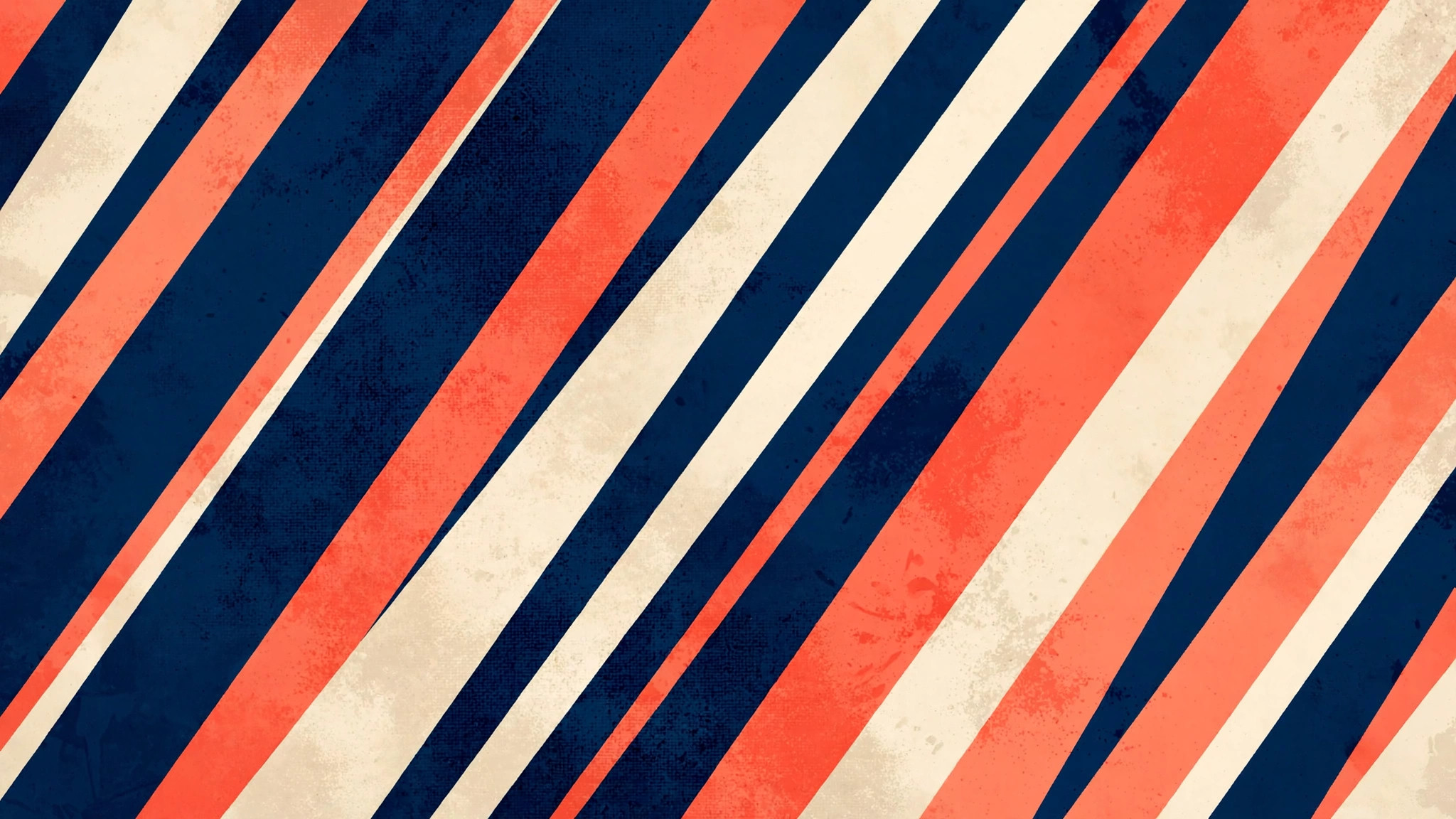
Of all the marks a designer can make, the diagonal stripe is the most restless. Horizontal lines rest; vertical lines stand; diagonal lines move. They imply speed, direction, and intent — a composition leaning into the future.
As a wallpaper, diagonal stripes turn that kinetic energy into rhythm: band after band of color marching across the screen in perfect, propulsive order. And the diagonal stripe is honest — no decoration, no hidden meaning, just repetition with conviction. Yet vary the width, shift the angle, alternate the palette, and the same humble stripe becomes sporty, elegant, rebellious, or serene: the white t-shirt of abstract design, simple, endlessly adaptable, and always in style.
The Psychology of the Slant
Why do diagonals feel so dynamic? Vision researchers point to how we scan: our eyes move horizontally when reading and rest on horizontals as stable. A diagonal breaks that rest — it is a line going somewhere, and the brain follows.
Designers have exploited this for over a century, from Italian Futurist posters to the stripe illusions of op art to racing liveries and the sash on a pageant winner. Diagonal stripes are visual momentum made visible.
On a screen, that momentum translates to energy. A diagonal stripe wallpaper makes a desktop feel alert, forward-leaning, ready. It is the opposite of a calming gradient: where a gradient soothes, diagonal stripes stimulate. Choose accordingly — stripes for mornings and momentum, gradients for evenings and ease.
Angle Matters
Not all diagonals are equal. A shallow angle — say fifteen degrees off horizontal — feels like a gentle push, a suggestion of movement. The classic forty-five degrees is the most dynamic, the most iconic, the racing stripe.
Steeper angles approaching vertical feel architectural and bold, like sunbeams through blinds. When browsing stripe wallpapers, notice the angle first: it sets the entire emotional temperature of the design.
Composing With Stripes
Stripe wallpapers live in the details of their repetition. Three variables do almost all the work:
- Width and spacing — uniform bands for engineered order, varied widths for syncopation and a handmade warmth.
- Palette — two-color boldness, three-color sophistication, or tonal bands within one hue family for calm.
- Texture and finish — flat stripes read crisp and modern; canvas, metal, or paper textures add tactility.
Width and Spacing
Uniform stripes — equal bands marching in lockstep — are the most classic and the most calming within the style. They read as pattern, as textile, as order. Varying the widths introduces syncopation: a wide band, then a thin one, then a medium — a rhythm with accents, like music.
Irregular spacing can feel handmade and warm; strict uniformity feels engineered and cool. Guides to geometric abstract painting trends favor uniformity, but some of the most memorable stripe wallpapers break the grid just slightly.
Palette Strategies
Two-color stripes are the boldest: navy and coral, black and gold, forest and cream. The high contrast makes each stripe an event. Three-color sequences add sophistication — a dominant hue, an accent, and a neutral to let the eye rest.
Tonal stripes, where bands shift subtly within one hue family, are the most wearable: all the rhythm of stripes with the calm of a gradient. These tonal versions are superb behind busy desktops, giving structure without competition.
Texture and Finish
Flat stripes are crisp and modern; textured stripes — canvas weave, brushed metal, paper grain — add warmth and tactility. A diagonal stripe in a linen texture feels like a well-made shirt; the same stripe in high gloss feels like a sports car. For large monitors, texture prevents the simplicity from feeling stark. For phones, flat and bold usually wins — texture gets lost at small sizes.
Stripes Across Devices
Diagonal stripes are among the most forgiving patterns for cropping, because the pattern has no center and no focal point — any slice contains the whole idea. This makes them ideal for multi-device users: one stripe wallpaper can serve desktop, tablet, and phone, each cropping a different section, and all three feel intentional.
Desktop
On wide screens, stripes running from upper-left to lower-right follow the natural reading direction and feel harmonious; the reverse diagonal feels more rebellious. Consider stripe width relative to screen size: on a 27-inch monitor, bands of 60–120 pixels create a confident rhythm, while hairline stripes can shimmer unpleasantly at large scales. The stripes should structure the space, not dominate it.
Mobile
Phones love bold stripes. A few wide diagonal bands in strong colors make a lock screen that is instantly recognizable — your phone, unmistakably. The stripes also frame the clock and notifications beautifully, the diagonal lines leading the eye without boxing it in. Portrait orientation favors stripes running corner to corner, maximizing their length and drama — the same corner-to-corner energy that drives bold geometric abstract poster designs.
Stripes That Ruled
Stripes have always meant something: the Breton mariner’s shirt, the regatta blazer, the heraldic bend — the line that declares. Coco Chanel borrowed the sailor’s stripes and made them fashion; the pinstripe made them power; the racing stripe made them speed. The stripe is the most assertive of patterns: it doesn’t suggest, it states — the direction given, the rhythm set.
Heraldry knew: the bend dexter, the diagonal band, the mark of the dynamic house. Sport knew: the sash, the slash, the motion implied. The diagonal stripe on your screen inherits that whole declarative tradition.
What the stripe really offers is the pleasure of the regular: the eye loves the beat, the mind loves the predictability-with-variation, the pattern that marches. It’s music made visual — the stripes as measures, the rhythm as design. The screen’s diagonals play that rhythm silently, all day: the Breton’s sea, the herald’s bend, the racer’s slash — the stripe’s long declarative history, marching across your screen. The rhythm doesn’t resolve; that’s its nature.
The Enduring Appeal of Forward Motion
Diagonal stripe wallpapers endure because they match how we want to feel about our devices: in motion, going somewhere, getting things done. They are the visual equivalent of a good playlist — rhythmic, energizing, and endlessly repeatable without wearing out. And when the energy ever feels like too much, the style offers its own antidote: the same stripes in whisper-soft tones, barely there, still moving but gently.
The diagonal never truly rests — but it can learn to glide. Find the angle and palette that match your pace, and let the stripes carry your screen forward.
Related posts:

Pieces in geometric-abstract talk to each other across pages — follow the thread with Geodesic Dome Wallpapers: Triangulated Depth in Abstract Form.
Share this page with a fellow art lover looking for their next wallpaper.

