

Introduction to Abstract Retro Texture in Modern Design
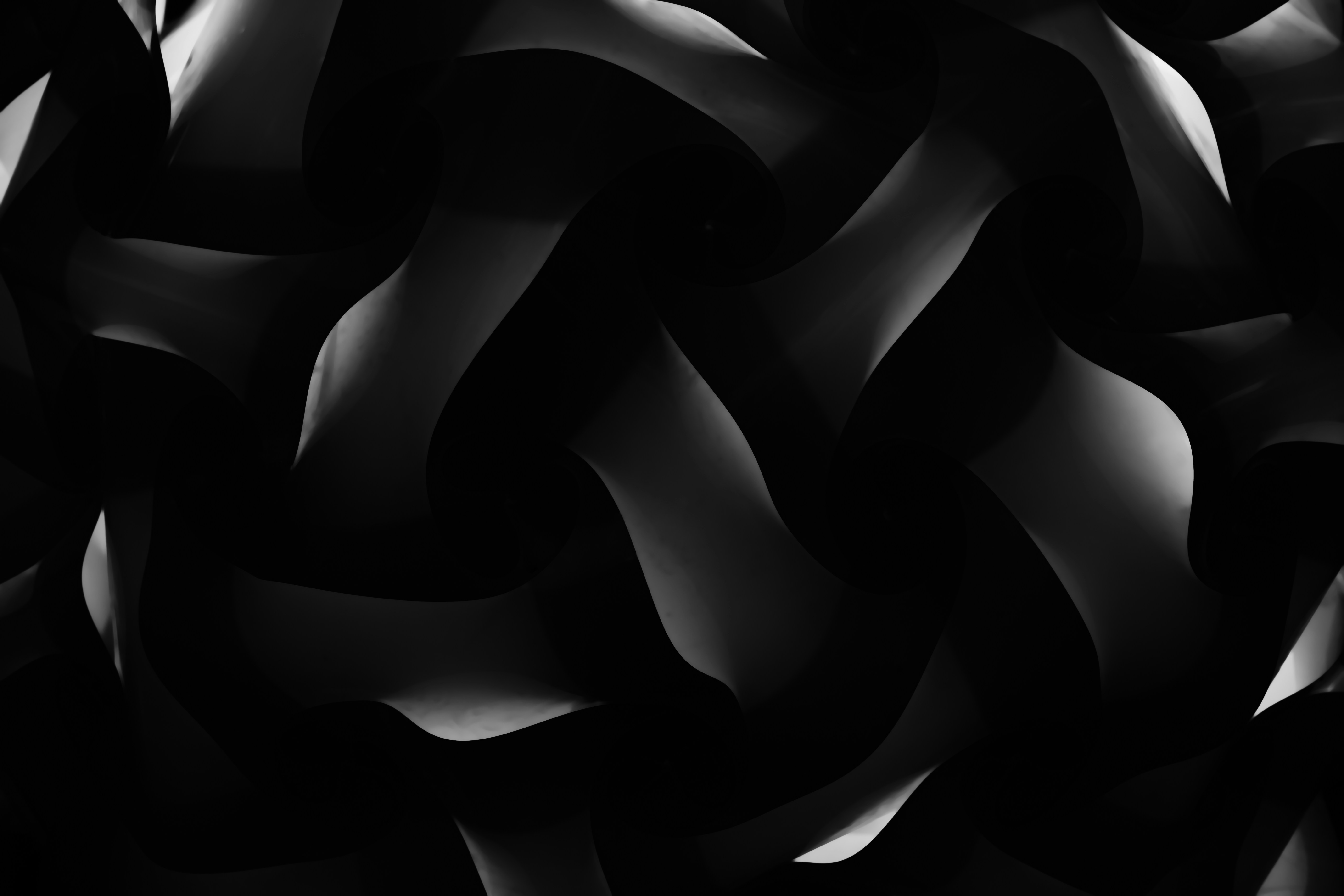
The resurgence of mid-century and late-20th-century aesthetic movements has brought abstract retro texture back to the forefront of digital and print media. Designers across the globe are constantly seeking ways to infuse warmth, nostalgia, and visual depth into their digital canvases. Whether you are crafting a vintage poster, designing a modern website interface, or creating compelling social media assets, mastering these tactile patterns allows you to evoke a distinct emotional response. By blending classic geometric shapes, distressed halftone dots, and muted color palettes, creators can bridge the gap between historical charm and contemporary design trends.
Understanding how these textures interact with modern grid systems, typography, and color theory is essential for creating cohesive visual projects. In this comprehensive guide, we will explore the historical roots of retro aesthetics, examine the core characteristics of abstract textures, and provide actionable techniques for integrating these elements into your workflow without overwhelming your composition.

In This Article
- Understanding Abstract Retro Textures
- Key Characteristics and Visual Elements
- Digital Tools and Creation Techniques
- Application in Branding and Web Design
- Frequently Asked Questions
Understanding Abstract Retro Textures
To truly leverage the power of abstract retro texture, one must understand the eras that birthed them. Ranging from the exuberant 1950s atomic age patterns to the psychedelic curves of the 1960s, and the gritty, geometric Memphis style of the 1980s, retro textures are defined by their imperfection. Unlike the hyper-clean, pixel-perfect interfaces favored by modern minimalism, vintage aesthetics celebrate the physical limitations of analog printing presses, screen printing mishaps, and aged paper degradation.
These textures tell a story. When a viewer encounters a design featuring subtle paper grain, faded ink bleed, or distressed vector shapes, their subconscious immediately registers authenticity and warmth. This tactile quality is particularly valuable in digital spaces, where flat design can sometimes feel sterile or uninviting. By incorporating organic imperfections, designers build a bridge between the viewer and the screen.

The Evolution of Vintage Aesthetics
Design movements rarely emerge in a vacuum; they react to the technological and cultural shifts of their time. The 1970s introduced earthy color schemes combined with heavy, flowing abstract shapes, while the 1980s favored neon highlights juxtaposed against concrete grit and raster lines. Recognizing these sub-categories helps designers select the exact flavor of vintage pattern needed for a specific project, ensuring stylistic consistency across all brand touchpoints.
Key Characteristics and Visual Elements
What makes a texture genuinely retro? It is rarely just one element; rather, it is a combination of color theory, grit, and geometric configuration. Let us break down the core pillars that define these mesmerizing visual assets.

- Halftone Dots and Screentones: Replicating the economic printing methods of newspapers and comic books, repeating dot patterns add immediate vintage texture.
- Subtle Grain and Noise: Simulating the look of aged film stock or uncoated paper stocks softens harsh digital gradients.
- Organic Shapes and Blobs: Mid-century modern art heavily utilized irregular, flowing shapes that mimic natural forms like pebbles and leaves.
- Muted or Off-Palette Colors: Desaturated mustards, burnt oranges, avocado greens, and dusty pinks anchor the retro feel.
Balancing Complexity and Negative Space
One of the common pitfalls when working with heavy visual assets is over-cluttering the composition. An abstract background should support your primary focal point, whether that is typography, photography, or a product showcase. Utilizing ample negative space allows complex retro textures to breathe, ensuring that your layout remains legible and visually balanced.
Digital Tools and Creation Techniques
Creating authentic-looking textures no longer requires rummaging through thrift stores for old magazines, though that remains a popular inspiration-gathering method. Modern software offers robust toolsets for generating and manipulating digital grit. Vector illustration suites allow for infinite scalability, while raster editors provide deep control over pixel-level distressing.

Step-by-Step Workflow for Custom Textures
Developing a signature visual style often starts from scratch. Follow this structured approach to build your own custom asset library:
- Step 1: Establish a monochromatic canvas in your preferred design software using a high resolution to preserve fine details.
- Step 2: Apply a dense noise filter or import a high-resolution scan of real kraft paper to serve as your base grain.
- Step 3: Layer vector shapes, using boolean operations to intersect geometric forms with organic curves.
- Step 4: Apply distressing effects such as threshold adjustments, roughening filters, or scanned ink-stamp overlays to weather the edges.
- Step 5: Export your final asset as a high-resolution tileable pattern or a standalone background graphic.
Application in Branding and Web Design
The versatility of retro design elements makes them suitable for a wide array of commercial applications. From craft brewery packaging and boutique fashion branding to indie music album art and editorial layouts, these textures communicate creativity and heritage. In web design, employing a subtle textured background on hero sections or footers can drastically elevate the aesthetic appeal without sacrificing loading performance, provided the assets are optimized correctly.

When branding with retro aesthetics, consistency is key. Ensure that the scale of your textures remains uniform across different mediums, whether printed on matte business cards or rendered on a high-definition retina display.
Conclusion
The enduring appeal of abstract retro texture lies in its ability to evoke nostalgia while remaining endlessly adaptable to modern trends. By embracing organic imperfections, thoughtful color palettes, and historical design cues, creators can produce work that stands out in a crowded digital landscape. Whether you are building a brand identity from the ground up or refreshing an existing digital interface, incorporating these tactile elements adds depth, character, and undeniable visual charm.
Frequently Asked Questions
- What defines an abstract retro texture? An abstract retro texture is a digital or physical pattern inspired by past design eras—such as the 1950s, 70s, or 80s—featuring organic shapes, geometric layouts, and analog imperfections like paper grain, ink bleed, or halftone dots.
- How can I make my digital designs look more authentic? You can enhance authenticity by incorporating subtle noise filters, avoiding pure digital black in favor of deep charcoal or dark brown, and using desaturated, earthy color palettes that mimic aged print materials.
- Are retro textures suitable for corporate website design? Yes, when used sparingly. A subtle retro background texture on section dividers or sidebars can add warmth and personality to an otherwise corporate or minimalist layout.
- What software is best for creating custom vintage textures? Vector editors like Adobe Illustrator are ideal for scalable geometric shapes, while raster programs like Photoshop or Procreate excel at applying realistic grain, brush strokes, and distressing filters.
- How do I keep textured backgrounds from distracting users? To maintain readability, lower the opacity of your texture layer, use blend modes like Multiply or Overlay, and ensure high contrast between your foreground typography and the background.
Related posts:


If this set speaks to you, Abstract Ink Beige Design: Elevating Modern Aesthetic Spaces continues the abstract-design conversation in a new direction.
Share this page with a fellow art lover looking for their next wallpaper.
